Configure your project
Because Storybook works separately from your app, you'll need to configure it for your specific stack and setup. Below, explore guides for configuring Storybook with popular frameworks and tools. If you get stuck, learn how you can ask for help from our community.
Add styling and CSS
Like with web applications, there are many ways to include CSS within Storybook. Learn more about setting up styling within Storybook.
Learn more
Provide context and mocking
Often when a story doesn't render, it's because your component is expecting a specific environment or context (like a theme provider) to be available.
Learn more
Load assets and resources
To link static files (like fonts) to your projects and stories, use the
staticDirs configuration option to specify folders to load when
starting Storybook.
Do more with Storybook
Now that you know the basics, let's explore other parts of Storybook that will improve your experience. This list is just to get you started. You can customise Storybook in many ways to fit your needs.
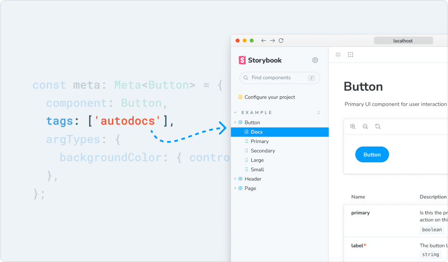
Autodocs
Auto-generate living, interactive reference documentation from your components and stories.
Learn more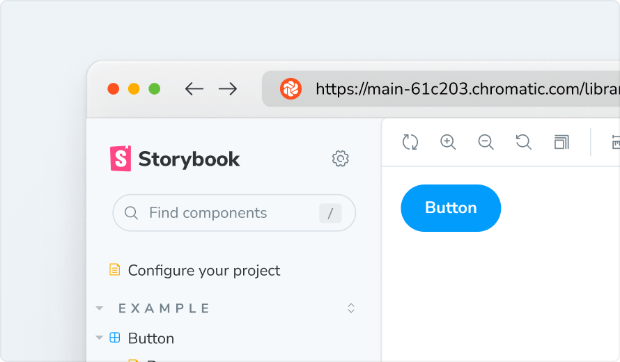
Publish to Chromatic
Publish your Storybook to review and collaborate with your entire team.
Learn more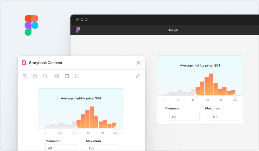
Figma Plugin
Embed your stories into Figma to cross-reference the design and live implementation in one place.
Learn more


Get support and chat with frontend developers.
Join Discord server
Watch tutorials, feature previews and interviews.
Watch on YouTube